 PluginStats
@phucbm/tailwindcss-components weekly downloads statistics
By phucbm (2 listings) · npm · Tailwind plugins
Tailwind CSS plugin with ready-to-use helper components for common layout patterns
@phucbm/tailwindcss-components has 3 recorded weekly downloads on npm, a decrease of 78.6% over the past 30 days, ranking #2257 of 2,322 tracked listings.
About @phucbm/tailwindcss-components
@phucbm/tailwindcss-components
A collection of ready-to-use helper components for Tailwind CSS that provide common layout patterns and utilities.
Installation
# Using npm
npm install @phucbm/tailwindcss-components

# Using yarn
yarn add @phucbm/tailwindcss-components

# Using pnpm
pnpm add @phucbm/tailwindcss-components
Usage
Add the plugin to your tailwind.config.js file:
// tailwind.config.js
module.exports = {
  // ...
  plugins: [
    require('@phucbm/tailwindcss-components'),
    // ...other plugins
  ],
}
Available Components
Flex Layout Helpers
Easily center content with flexbox.
<div class="fl-center">Centers both horizontally and vertically</div>
<div class="fl-center-v">Centers vertically only</div>
<div class="fl-center-h">Centers horizontally only</div>
Absolute Positioning Helpers
Position elements absolutely with ease.
<div class="ab-center">Centers absolutely both horizontally and vertically</div>
<div class="ab-center-v">Centers absolutely vertically only</div>
<div class="ab-center-h">Centers absolutely horizontally only</div>
<div class="ab-full">Covers its parent completely</div>
<div class="ab-full-b">Pseudo-element ::before covers parent</div>
<div class="ab-full-a">Pseudo-element ::after covers parent</div>
<div class="ab-full-ba">Both pseudo-elements cover parent</div>
Image Size Helpers
Handle image sizing with ease.
<div class="img-wrapper-cover">
  <img src="..." alt="..."> <!-- Will cover the container -->
</div>

<div class="img-wrapper-contain">
  <img src="..." alt="..."> <!-- Will be contained in the container -->
</div>
List Style Helpers
Clean list styling without bullets or padding.
<ul class="list-style-none">
  <li>Item without bullets or padding</li>
</ul>

<div class="list-style-none">
  <ul>
    <li>Item without bullets or padding</li>
  </ul>
</div>
Transition Helpers
Add simple transitions.
<div class="t">Element with standard transition (.25s)</div>
<div class="t t-slow">Element with slow transition (.6s)</div>
Loading Helpers
Add loading spinners and overlays.
<div class="loading">
  Content with loading overlay and spinner
</div>
You can customize the loading appearance with CSS variables:
:root {
  --loading-size: 50px;
  --loading-color: blue;
  --loading-bg: rgba(255, 255, 255, 0.9);
}
Flex Grid Template
A flexible grid system using flexbox.
Unlike CSS Grid, flex-grid-template leverages Flexbox to provide superior item alignment capabilities like justify-content:center,
what you can't do with tailwind's grid.
<div class="flex-grid-template">
  <div>Item 1</div>
  <div>Item 2</div>
  <div>Item 3</div>
  <!-- Default is 3 columns, responsive down to 1 -->
</div>

<div class="flex-grid-template flex-grid-col-4">
  <!-- 4 columns -->
</div>
You can customize gap sizes using the provided utilities:
<!-- Using Tailwind's spacing scale -->
<div class="flex-grid-template flex-grid-gap-4">
    <!-- Both x and y gaps set to 1rem (4 in the spacing scale) -->
</div>

<div class="flex-grid-template flex-grid-gap-x-8 flex-grid-gap-y-2">
    <!-- X gap: 2rem (8), Y gap: 0.5rem (2) -->
</div>

<!-- Or with inline styles for custom values -->
<div class="flex-grid-template" style="--grid-gap-x: 20px; --grid-gap-y: 40px;">
    <!-- Custom gaps -->
</div>
Skeleton Background
Add skeleton loaders.
<div class="skeleton-bg">
  Loading content placeholder with animated spinner
</div>
License
MIT
Description from the npm listing.
- tailwind
- tailwindcss
- tailwindcss-plugin
- css
- components
- helpers
- layout
- flex
- grid
README badge
Show your rank in a README or on your website. The badge updates automatically.
Charts
Images: 30d · 1y · all time · 1600×900 dark


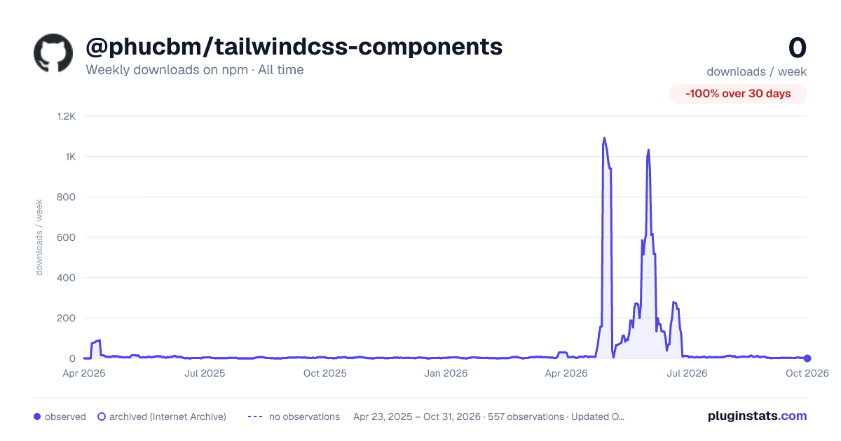

Adoption over time
7/30/90-day growth
Ranking history
Listing placement
Listing placement
Filled points are observed values; hollow points come from Internet Archive snapshots of the listing page. Dashed segments span periods with no observations — values between points are not interpolated.
Each band is one page of 20. Weekly downloads on a linear scale. Placement is projected from weekly downloads, so it can differ from the marketplace's own sort order. Hover a dot to see the listing.
Recent observations
Full history (544)Similar npm Tailwind plugins plugins
All 20 @phucbm/tailwindcss-components alternatives- 3 weekly downloads-66.7%
Data source
Weekly downloads (trailing 7 complete days) come from the official npm downloads API. Downloads include CI and mirrors and are not equivalent to installs or users. npm publishes no ratings.
Listing: https://www.npmjs.com/package/@phucbm/tailwindcss-components. First seen Oct 16, 2026; last successful collection Oct 20, 2026. See the methodology.