 PluginStats
kitecss weekly downloads statistics
By pankaj7288 · npm · Tailwind plugins
A comprehensive, responsive component library plugin for Tailwind CSS v4
kitecss has 5 recorded weekly downloads on npm, a decrease of 70.6% over the past 30 days, ranking #2193 of 2,322 tracked listings.
About kitecss
KiteCSS: A Modern Component Library Plugin for Tailwind CSS


KiteCSS is a comprehensive component library reimagined as a Tailwind CSS plugin. It seamlessly integrates a collection of over 60 professionally designed, responsive, and fully customizable components directly into your Tailwind workflow.
By leveraging the plugin architecture and Tailwind v4's modern engine, KiteCSS ensures that only the CSS you actually use is included in your final build, providing an optimized, "zero-bundle-size" component experience.
Features
- 60+ Components: From simple buttons and badges to complex accordions and carousels.
- Fully Responsive: Components are designed to work beautifully on all screen sizes.
- Zero Configuration: Works as a standard Tailwind plugin imported directly in your CSS file—no
tailwind.config.jsrequired. - Automatic Tree-Shaking: Only the components you use in your markup are generated in your final stylesheet.
- Fully Customizable: All components are built with CSS variables that you can easily override using a standard
@themeblock.
Installation
Prerequisites
- A project using Tailwind CSS v4 or newer.
Step 1: Install the Package
Install KiteCSS from the npm registry:
bun add kitecss
Step 2: Activate the Plugin in Your CSSIn your main CSS file, @import the tailwindcss engine and your new kitecss plugin. You can also define your content sources here./* src/input.css */

@import "tailwindcss";
@import "kitecss";

@source "./src/**/*.{html,js,jsx,ts,tsx}";
Usage ExampleSimply add the component classes to your HTML elements.<!-- Alert -->
<div class="alert alert-success">
  <span>Your profile was updated successfully!</span>
</div>

<!-- Button -->
<button class="btn btn-primary">Primary Button</button>

<!-- Card -->
<div class="card card-bordered w-96">
    <div class="card-body">
        <h3 class="card-title">KiteCSS Card</h3>
        <p>A beautifully integrated card component.</p>
        <div class="card-actions justify-end">
            <button class="btn btn-primary">Action</button>
        </div>
    </div>
</div>
Theme CustomizationTo override the default colors and radius values, add a @theme block to your main CSS file./* src/input.css */

@import "tailwindcss";
@import "kitecss";

@source "./src/**/*.html";

@theme {
  /* This will override the default --color-primary */
  --color-primary: #e11d48; /* Your brand's rose color */

  /* This will override the default --radius-md */
  --radius-md: 1rem;
}
Description from the npm listing.
- tailwindcss
- tailwindcss-plugin
- css
- components
- ui
- framework
- responsive
README badge
Show your rank in a README or on your website. The badge updates automatically.
Charts
Images: 30d · 1y · all time · 1600×900 dark


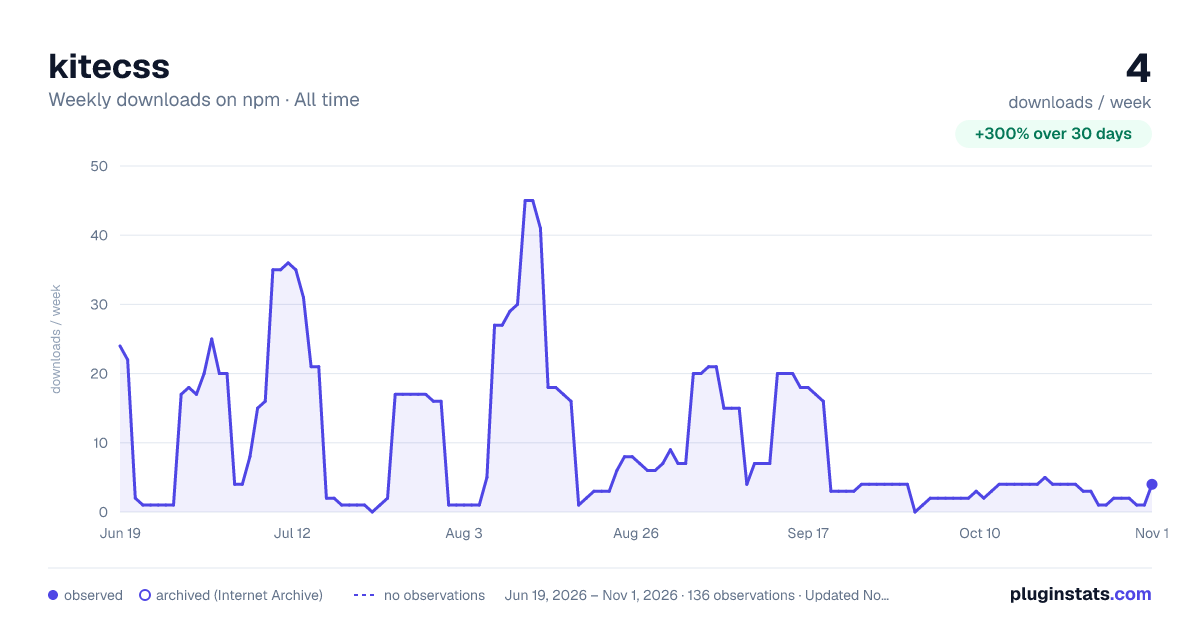

Adoption over time
7/30/90-day growth
Ranking history
Listing placement
Listing placement
Filled points are observed values; hollow points come from Internet Archive snapshots of the listing page. Dashed segments span periods with no observations — values between points are not interpolated.
Each band is one page of 20. Weekly downloads on a linear scale. Placement is projected from weekly downloads, so it can differ from the marketplace's own sort order. Hover a dot to see the listing.
Recent observations
Full history (122)Similar npm Tailwind plugins plugins
All 20 kitecss alternativesData source
Weekly downloads (trailing 7 complete days) come from the official npm downloads API. Downloads include CI and mirrors and are not equivalent to installs or users. npm publishes no ratings.
Listing: https://www.npmjs.com/package/kitecss. First seen Oct 16, 2026; last successful collection Oct 20, 2026. See the methodology.