 PluginStats

React Buddy downloads statistics
By JetBrains s.r.o. (640 listings) · JetBrains Marketplace · GUI Builder
React Buddy helps developing applications based on React.js and related libraries. Provides component palettes for MUI (MaterialUI), Ant Design, Chakra UI, Mantine...
React Buddy has 1,060,966 recorded downloads on JetBrains Marketplace, ranking #273 of 2,502 tracked listings.
Rating: 4.41 / 5 from 44 ratings
About React Buddy
React Buddy helps developing applications based on React.js and related libraries. Provides component palettes for MUI (MaterialUI), Ant Design, Chakra UI, Mantine. Helps to create and use Storybook stories.
⚠️ Storybook in React Buddy is deprecated
JetBrains has released Storybook Connect, a more comprehensive solution for browsing, navigating, and generating stories, built with AI in mind. It adds a Storybook tool window with two-way selection sync, dev server control, one-click Storybook setup, and a storybook-connect CLI that analyses component props and generates missing stories. Learn more in the documentation.
The Storybook features in React Buddy are now officially deprecated and will be removed later. Please share requests and feedback in YouTrack.
Coding Assistance
• Event handler generation • useRef generation • JSX lists generation (.map postfix completion, quick fix for array-like objects) • State generation • Intention to convert local variable to useState • Quick-fix to create state variable from non-existing symbol passed to a JSX prop • .state postfix completion • New component creation action • Live templates for React hooks • usest - useState • usee - useEffect • usec - useContext • userd - useReducer • usecb - useCallback • usem - useMemo • user - useRef • useih - useImperativeHandle • usele - useLayoutEffect • usedv - useDebugValue • Quick-fix for adding new props (TS declarations) straight from JSX • Intention to wrap a handler in useCallback(). Quick fix detecting missing deps (switched off when eslint integration enabled) • Intention to surround a JSX element with condition • Intention to wrap a functional component in React.memo() • Gutter icons designating React hooks and handlers
Interactive Component Preview
• Preview the particular component, not the whole app • Navigate to the source code by clicking on any element in the preview • See component re-renders • Highlight selected component in the preview • Tested support for projects based on Vite, Next.js (10+) and Create React App
JSX Outline
• Observe React components structure (JSX, hooks, handlers) • Navigate to/from the particular JSX element • Copy-paste and move JSX nodes • Add conditional rendering • Insert components from the Palette
Components Palette
Palette tool window activates when a tsx/jsx file is opened. Alternatively you can browse palette via code generation action (Alt + Insert / ⌘ N)
• Observe available components/reusable blocks. Preview each component right in the IDE • Drag and drop components from the palette to the source code / JSX outline • Double click on the component to add it to the source code • Configure your own palette or use the predefined ones • We provide several ready-to-use palettes. The plugin detects supported libraries/versions and suggests to install the corresponding package: • MUI - @react-buddy/palette-mui demo • Ant Design - @react-buddy/palette-antd demo • Chakra UI - @react-buddy/palette-chakra-ui demo • Mantine (core + form) - @react-buddy/palette-mantine demo • React Intl @react-buddy/palette-react-intl demo
Component Inspector
• View and search through selected element's properties • Change properties using visual components • Generate handlers
App Component Tree
• View hierarchy of React application components • View paths of components used in (react router) routing
Storybook support (deprecated)
These features are superseded by Storybook Connect and will be removed in a future release.
• Storybook components tool-window (displays stories defined inside the project) • Code generation by Storybook stories (d'n'd from the tool window / use code generation action) • Intention to create a story for React component • Live templates for story creation (story6, story7) • CSF 3 (Storybook 7) support • MDX format support
Ant Design support
• Visual designer for Antd Form.Item validation rules
Quick Start
Open any file containing React components. In order to use preview functionality @react-buddy/ide-toolbox dependency should be added and some configuration should be done in the project. The plugin will suggest to add all required files automatically.
See the documentation to configure the preview manually.
Requirements
The plugin supports projects based on React.js (16.5+) and preact. Better experience is provided for TypeScript-based projects.
Find us at
react-buddy.com twitter.com/reactbuddy discord
Description from the JetBrains Marketplace listing.
- GUI Builder
- JavaScript
- Productivity
- Web
README badge
Show your rank in a README or on your website. The badge updates automatically.
Charts
Images: 30d · 1y · all time · 1600×900 dark
Adoption over time
7/30/90-day growth
Ranking history
Ratings over time
Listing placement
Listing placement
Listing placement
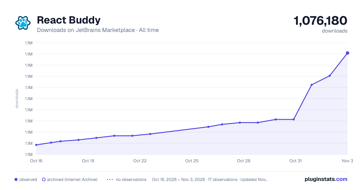
Filled points are observed values; hollow points come from Internet Archive snapshots of the listing page. Dashed segments span periods with no observations — values between points are not interpolated.
Each band is one page of 20. Downloads on a linear scale. Placement is projected from downloads, so it can differ from the marketplace's own sort order. Hover a dot to see the listing.
Recent observations
Full history (5)Similar JetBrains Marketplace GUI Builder plugins
All 20 React Buddy alternatives



Data source
Cumulative download counts come from the public JetBrains Marketplace API. JetBrains reports downloads, not active installs. Ratings are the mean of public votes.
Listing: https://plugins.jetbrains.com/plugin/17467-react-buddy. First seen Oct 16, 2026; last successful collection Oct 20, 2026. See the methodology.